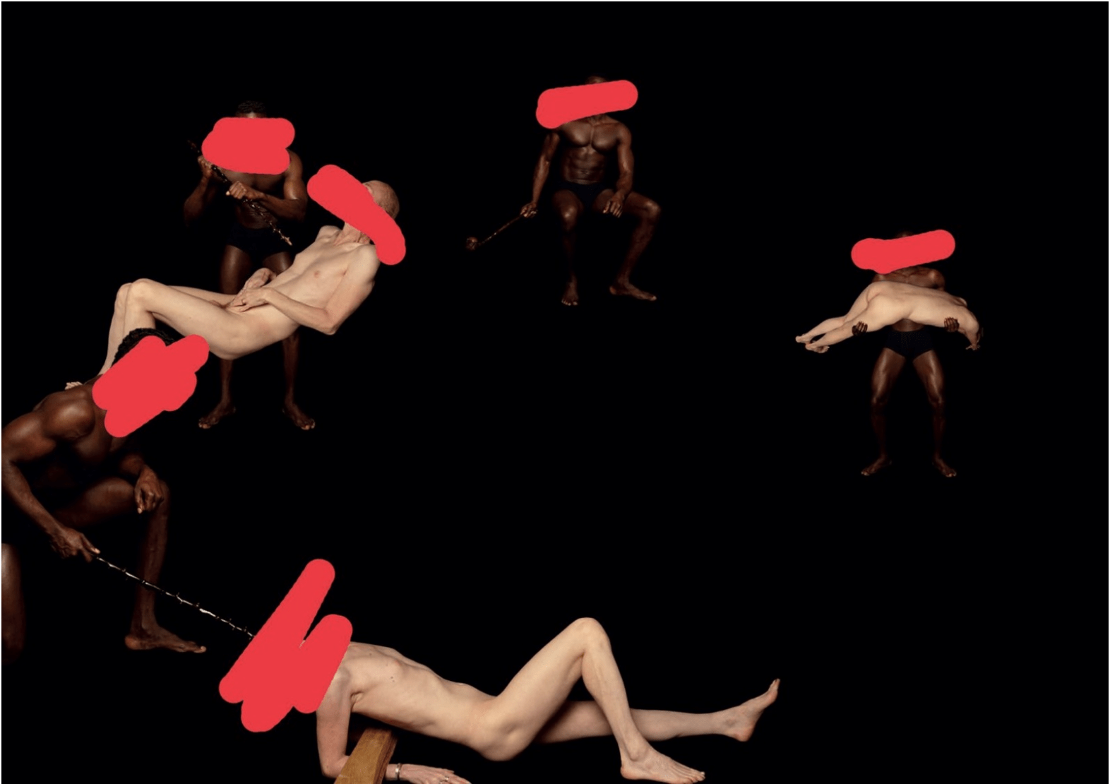
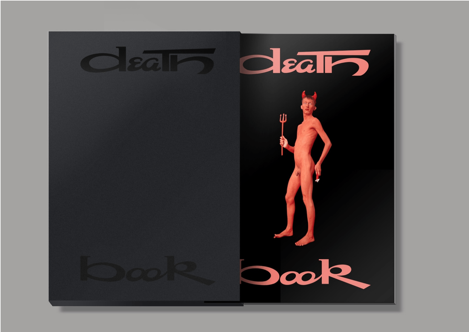
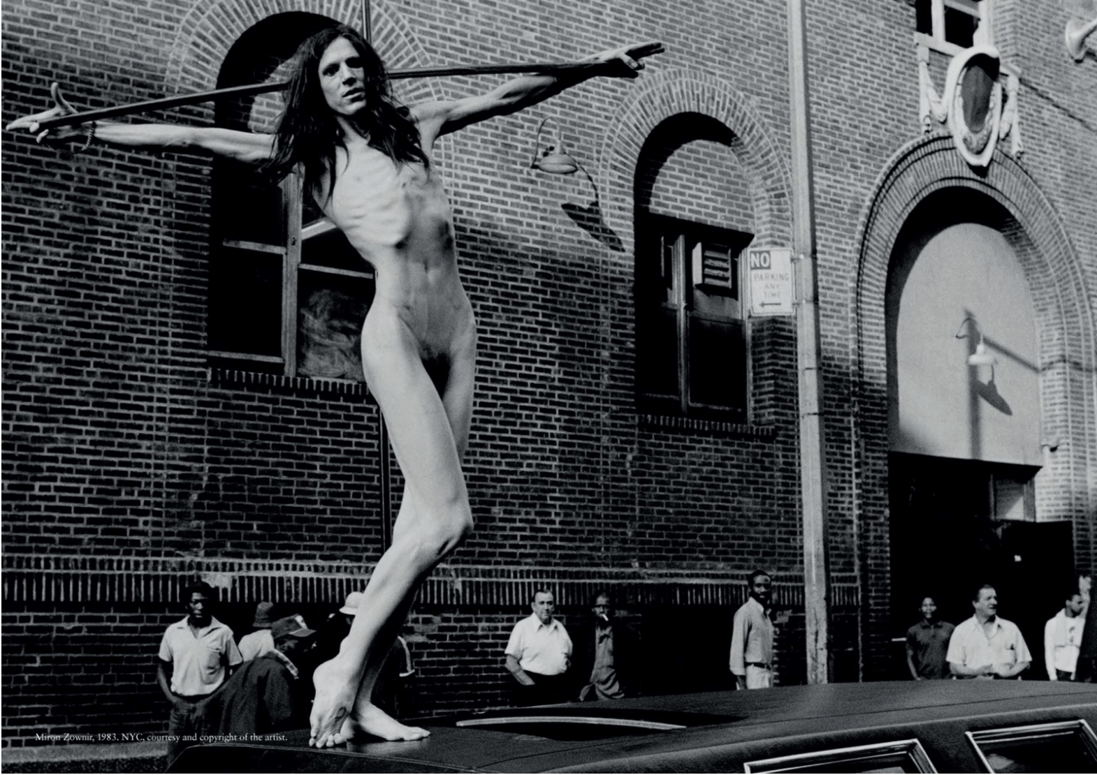
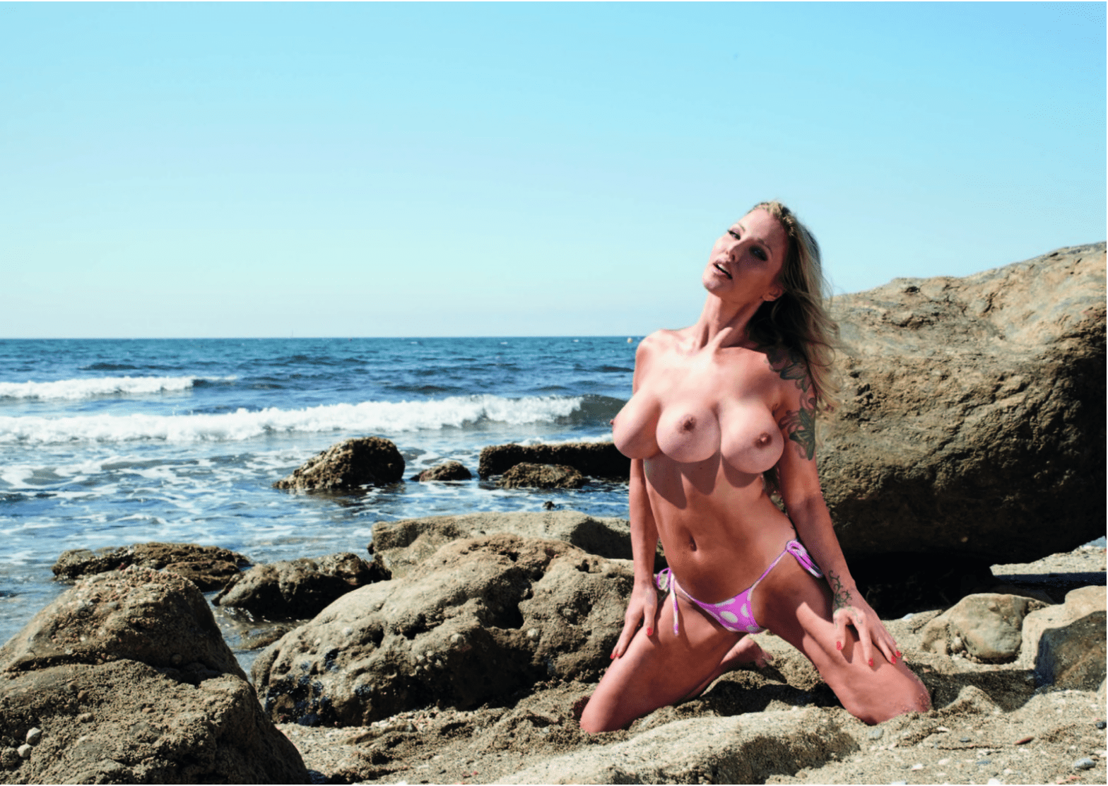
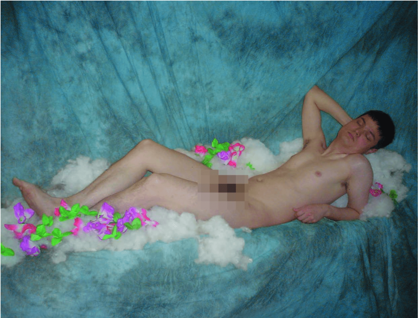
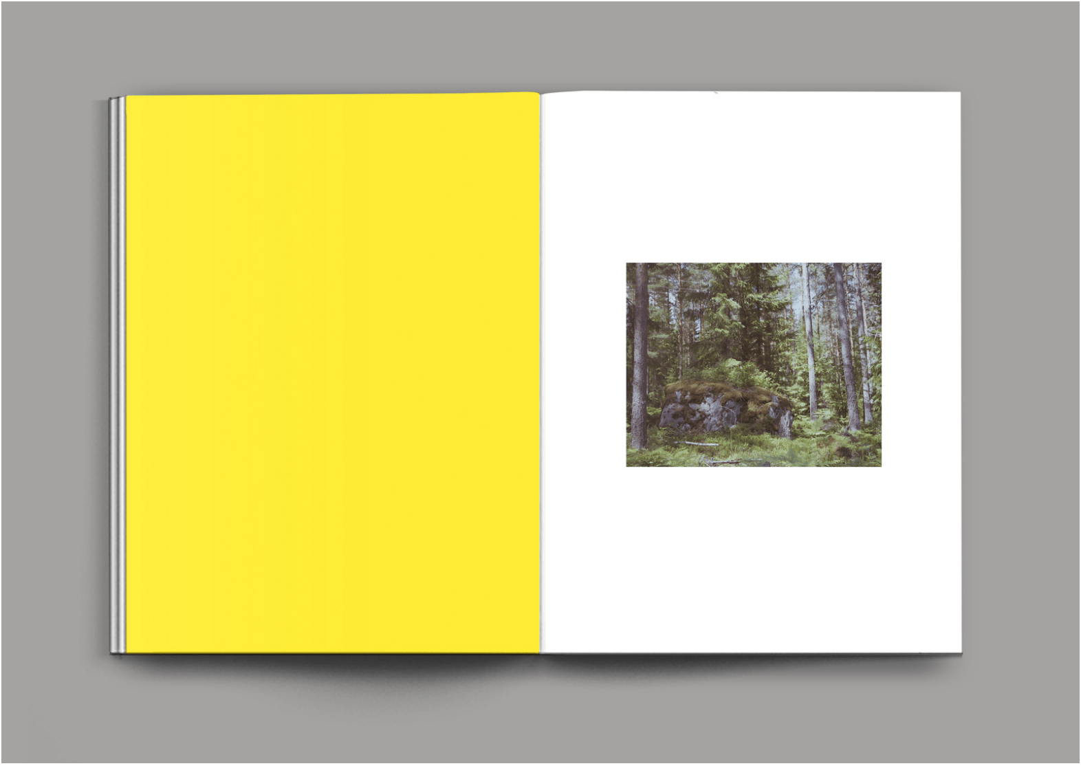
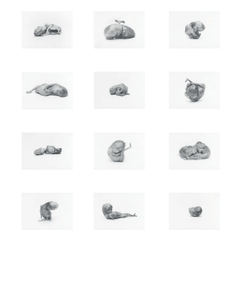
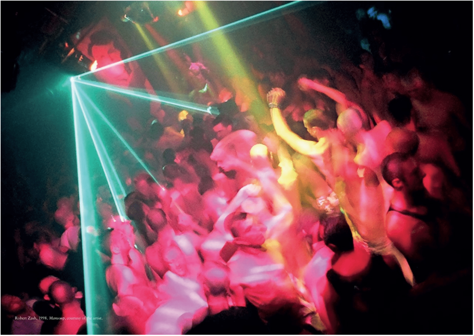
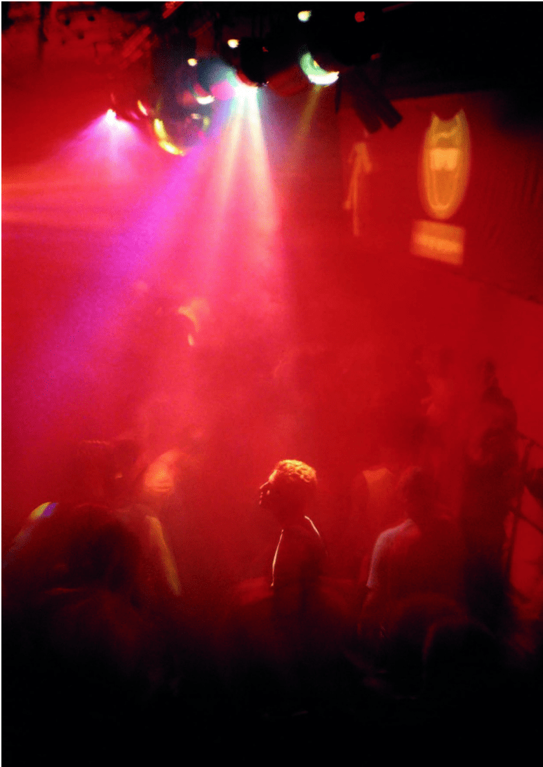
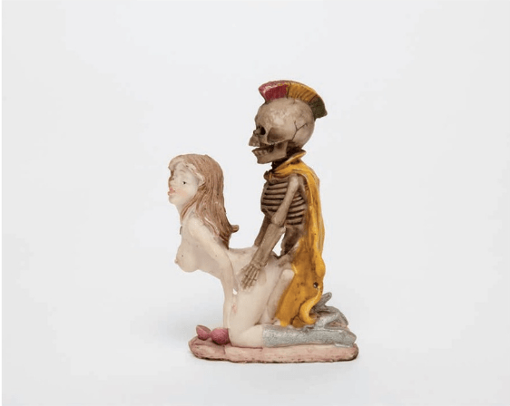
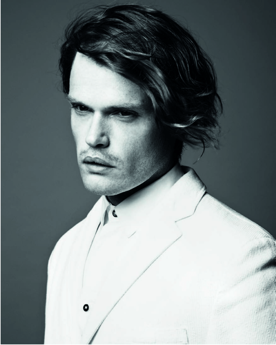
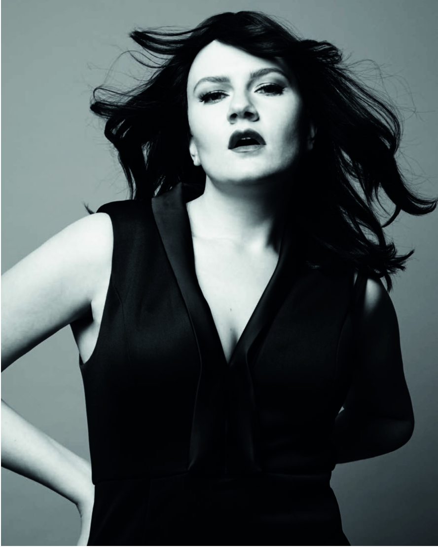
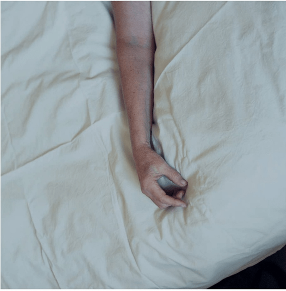
Death Book examines taboos that surround sex and death in contemporary society. It shows the unique point of view of editor Matthew Holroyd (b. 1980, Germany) and photographer Edith Bergfors (b. 1986, Norway). The creation of Death Book was especially important for Bergfors, who lost her mother in 2011. The act of putting images together in a narrative became a therapeutic process that fulfilled the project with the photographer’s own reflections on death and grieving. The book contains Bergfors’ photography, archival material and vernacular images that highlight the thin line between thanatos – the death instinct – and libido – a representation of physiological energy associated with sexual urge. Being a creative director and founder of Baron and Baroness art and fashion magazines, Holroyd made sure that the book also gives a spectator insight on fashion, photography and print design.
In order to understand more about the complex kinship of sexual desire with acceptance of mortality, GUP spoke to Bergfors and Holroyd. The result brought to light some crucial answers on the deep-rooted existential questions and disclosed themaking of Death Book – awork that is both tempting and eerie.
Death Book examines the connections between sex and death; what is the inspiration for approaching such subjects?
Edith Bergfors (EB): We were both inspired by how sex and death are used as control mechanisms.
Did you come up with the idea of the book together with Matthew Holroyd?
EB: Matthew and I were introduced to each other by Dallas Seitz, an artist and contributor to the book, back in 2008. We began working with each other, and have since been collaborators and friends. After my mother died we were discussing various elements surrounding aspects of death as digital remnants, hell, the humour and banality that is often taboo, and decided to begin working on the book.
What is the idea behind the format of Death Book?
Matthew Holroyd (MH): The book comes in a matte black slipcase, with the title blind embossed, which is subtly reminiscent of a gravestone. Also, as there is a nude male on the cover, it allows us to sell the book in environments which normally prohibit the sales of “pornographic” imagery. The choice of paper stock was one of testing out various weights and finishes to find one that could accommodate the variety of imagery in the book.
Why did you opt for using different vernacular material and not only your own work?
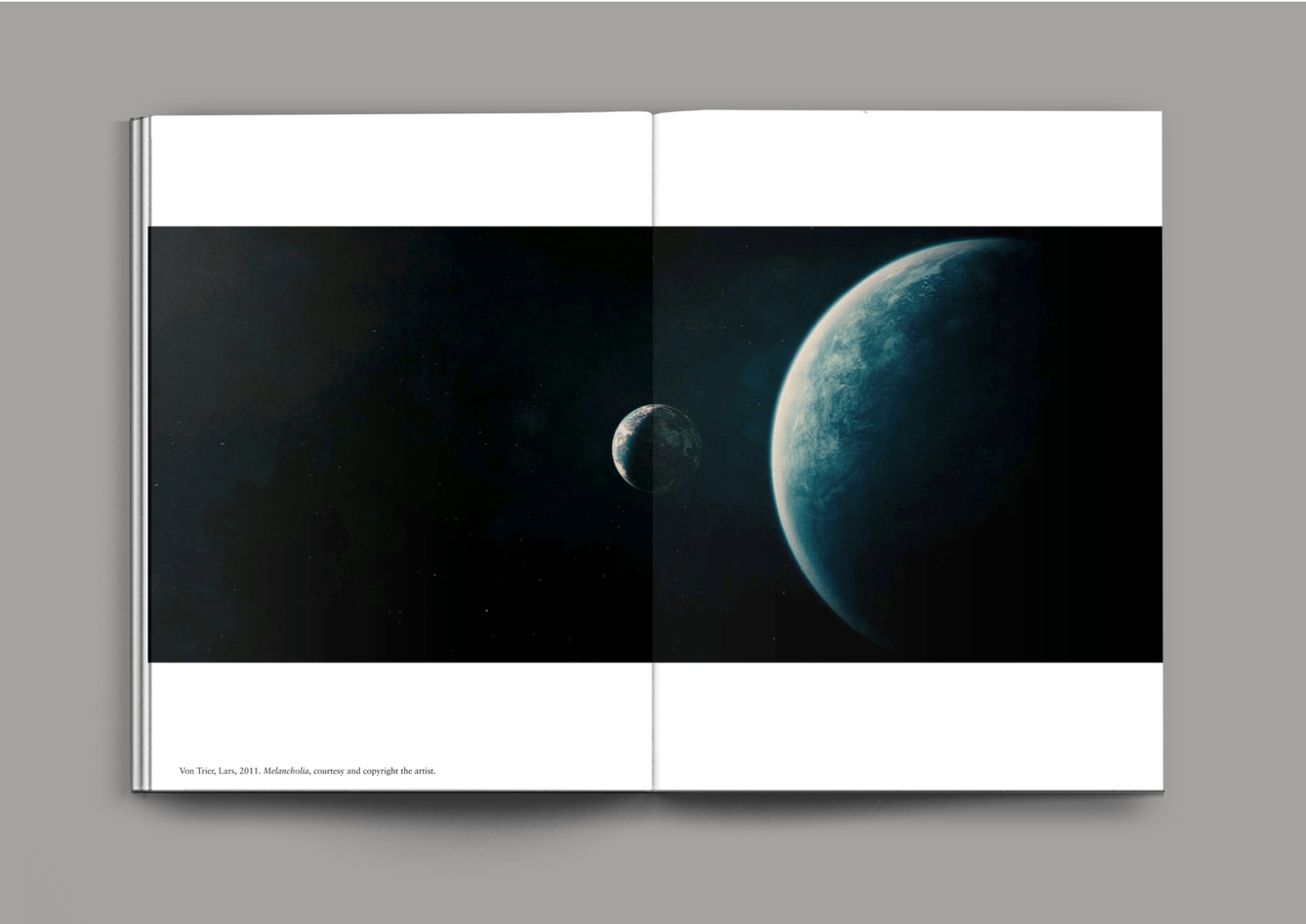
EB: We wanted the book to feel like a research project, and to include various approaches other than our own, so we looked back on our own personal inspirations from the past. Because Matthew and I had been discussing the project over such a long period of time, it felt natural that different references that spoke to us should be included. Alongside that, there was new work that we were both discovering, and felt it appropriate to include, as they brought new perspectives to the project. For example, the film Melancholia by Lars von Trier was a film that we both found incredibly relevant, and had already based a shoot for Baron magazine on about the end of the world, so it felt necessary to include those stills in the book.
What are the intentions behind your storytelling?
EB: We decided to not include any text to accompany the images, which allows the images themselves as well as the edit/narrative to be open to interpretation. It’s impossible to create a wholistic project about a subject so immense and non-physical, so it’s only natural that each spectator will have their own interpretation already. The narrative was more of a rhythmic edit than a linear one, and I hope this opened it up, even more, to allow for an individual response.
What is the reaction of your audience to the images from the book?
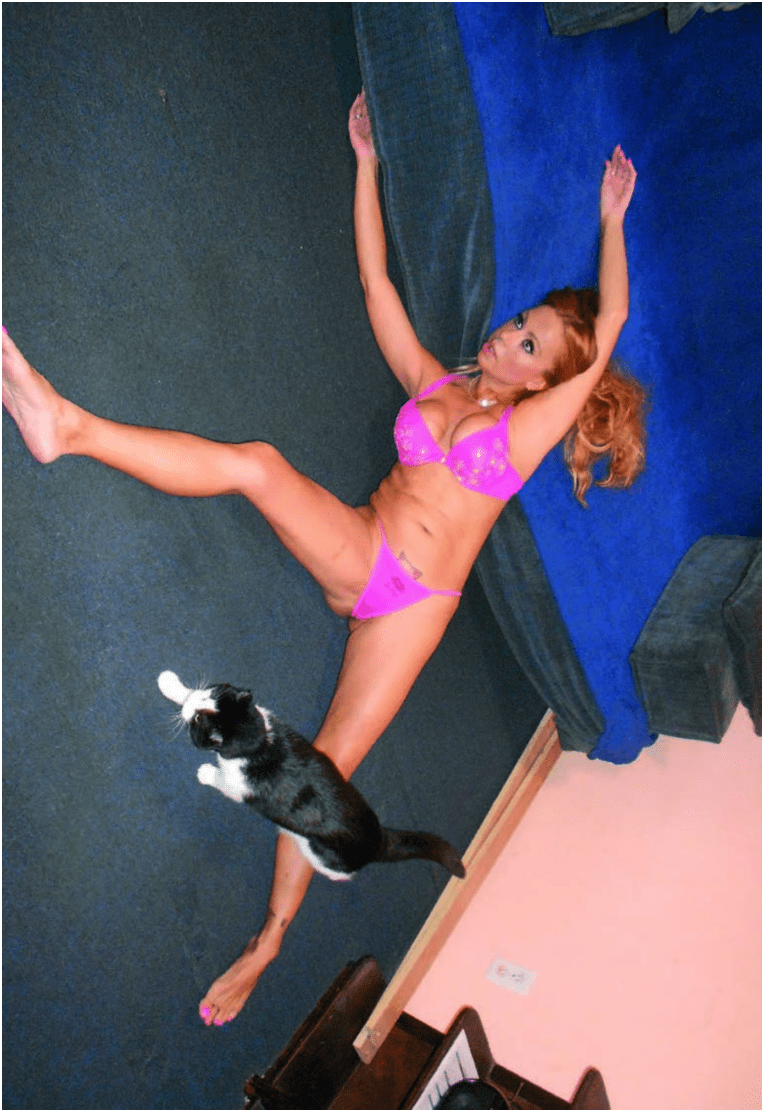
EB: I guess the topic of death is already an uncomfortable one for all the obvious reasons, but on top of that, the hints towards things like bestiality without being too obviously provocative are what cause mild discomfort. What surprised me in the response from people that I got, was that the more brazen sexualised images, for example, the three tit lady (presented in the book), caused less of a stir than the image of the inside of a crashed car, which people seemed to be moved by more as it seemed more “realistic” despite not knowing the context of what had happened.
What visuals and concepts inspire you on a daily basis?
EB: Generally, I love watching the little twitches and movements of people, and what meaning they carry and why. There are a few people who consistently give me an injection of inspiration, just out of their own strength of character – ranging from people like my 85-year-old neighbour in Marbella, who I see potentially once a year, to my wife Anna.
MH: I have recently been inspired by fashion shows and clothing. There are currently some interesting conceptual labels and the combination between a presentation of concepts via clothing and a catwalk show I find exciting and reminiscent of some of the conceptual labels of the late nineties and early 00’s such as Boudicca to Shelley Fox.
What determines Death Book project?
EB: Matthew and I went through my archives of images, starting from the period of time when my mum died, as well as my previous work. The car crash image, for example, is back from my foundation year, and the rock images also belong in my personal archive – it was a time where I would photograph the same rock each time I passed by it. We then planned to make some new images, like the three tit lady and Putto, as well as approaching other collaborators. It was made over approximately four years and edited as we went along until it felt like it was complete.
Are you working on a new project at the moment?
EB: At the moment I’m working on a portrait project about my wife. We met in 2016 and naturally that was an immediate inspiration. Since then, the images have developed to be a portrait of both herself and her transition, as well as our relationship.
MH: I have the forthcoming issue of Baron coming out which is Baron by the photographer Petra Collins and we are also currently working on our new issue of Baroness, which is in collaboration with the actress Sarah Baker.
Is there a recurring theme that comes back in all your projects?
EB: I suppose there’s a tendency for me to include an aspect of challenging conventions and stereotypes, though visually this manifests itself in a variety of ways.
MH: Yes, my background always seems to be a source, such as the town I grew up, my family, my sexuality and friends.